

WHAT IS CHIVALRIC? A brand new hosting service company that aims to primarily host servers for various games and discord bots. They aim to please their clients through integrity and servers that are 100% protected and safe.
THE PROBLEM The team didn't have a brand and they really needed a firm identity that was strong and creative, I was graciously given a lot of creative freedom with this project and ran with some unique ideas that I felt worked perfectly with the company and what they were attempting to represent with their goods and services.
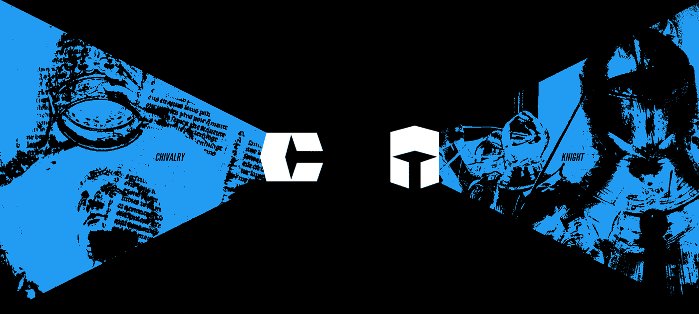
THE SOLUTION Through my personal brainstorming, feedback from the Chivalric team, and a firm goal, I created a brand and name that revolved around Chivalry, hence the name "Chivalric". Involving the horsemen and knights of the middle ages, this brand is strong, trustworthy, and loyal. The logo was made into a C to connect it to the brand name, but when flipped on its side, the logo becomes a knight's helmet. We had experimented previously in some rejected concepts with the idea of theming everything around playing cards, this idea was cool but did not work contextually with the old name of the brand or the feel we were going for. We did however, repurpose some old elements from the playing card concepts we made and used them in forging this new mark! Now sit back and enjoy the presentation :)
Jordan Designs • Chivalric Brand Identity • 2023

THE CREATION Creating this mark was a lengthy process of discovery, the initial name of the company was "Vanguard" and we had went with a theme of playing cards.* This theme felt good but the logo I made didn't feel connected with the company. After some brainstorming, a new name was created and Chivalric came to be! We used an element from the old logo in order to make the new one, it was a very cool process!

* This logo for "Vanguard" was meant to be 2
playing cards leaning against each other, they also
formed an upside down "V"


FONTS A beautiful pairing of the tall, structured letters of League Gothic with the intricate beauty of a nice clean serif like EB Garamond just felt right when looking at the brand. I wanted to keep everything current day while still using detailed accents to amplify the brand and help it honor the time it's based on.

ILLUSTRATIONS A lot of the elements of the brand like posters and advertisements have illustrations that are from the British Library Flickr Page which provides thousands of free, public domain images from their library that can be re-used! You'll see these pop up commonly throughout the project, I really really wanted to incorporate these historical illustrations and breathe new life into them!


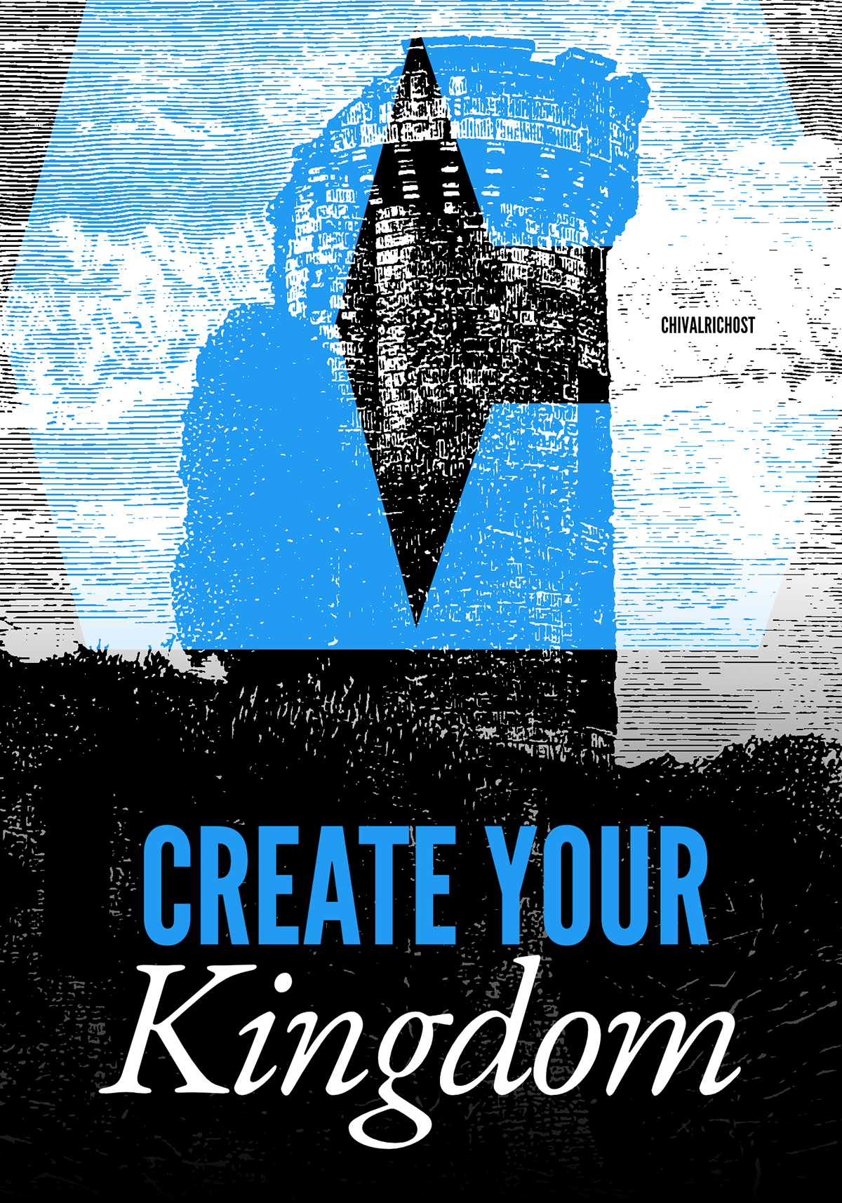


The illustration above is composed of two images from the British library! These pieces are so cool and they worked perfectly in this mockup for the potential design of the website. The concept was to show two people entering a city and showing how you too can open the gates to your own creation with Chivalric.


THE KNIGHT This brand element is used as a way of showing how people can write their own stories through hosting with the company, every action in a game or creation they make with a bot that's hosted with Chivalric will have it's own unique story written through the 1's and 0's. This image is made up entirely of text, just zoom in to see it!


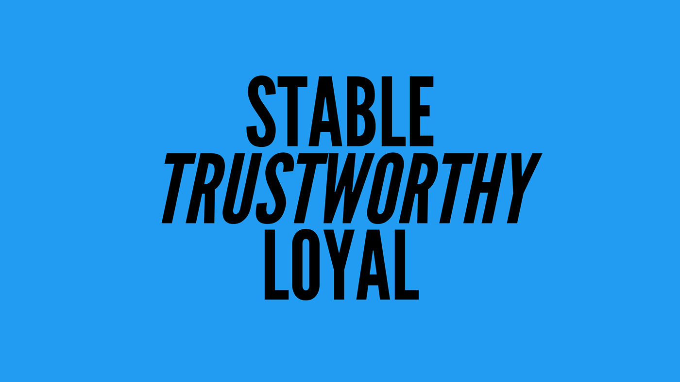
COLOR In my brainstorming and discussions with the team, we had gone through TONS of colors, red was our first pick from the playing card theme but it really didn't look right with what we were trying to make, we had then gone with a nice yellow to emulate the color scheme of swiss-suited playing cards. These two colors didn't really match with the theme of the brand though and didn't feel related to technology or the mission of Chivalric. Finally, we picked this nice blue which became an instant hit for its trustworthiness, stability, relation to the technology field, and how it blended with the elements in the brand.


BRAND STYLE I went with this textured halftone style in order to try to replicate the line art that was commonly used in medieval heraldry, drawings, and art. I also wanted it to add a paper texture as written documents and art were one of their only ways of documenting history, world events, and more in the 11th and 12th centuries.


2024, Chivalric Branding & Guidelines
Want work done? Find me here! bit.ly/jordandesigns
jordandesigns028@gmail.com


